Spruce is a (B2B, SaaS) technology-driven real estate services company that provides title and closing services to enable real estate and mortgage transactions across the U.S. Spruce provides title search, policy, settlement, and escrow—by pairing intuitive software with real, human expertise.
Intro
Reimagining Escrow Transactions
Overview
The problem
The accounting team has to manually enter each incoming and outgoing transaction for every order, leading to repetitive tasks and potential errors. The system displayed irrelevant information, required repetitive data entry, and did not adhere to standard ledger and financial statement formats. This is a problem because reduces operational efficiency, increases the risk of inaccuracies, and fails to uphold the expected norms for maintaining financial records and reporting.
Project Type
Desktop WebApp (Internal Facing)
My Role
Lead Product Designer
Team Structure
Product Manager, Director of Design, FE + BE Engineers
Duration
4 Months
Success Metrics
Task completion, user adoption, and satisfaction
Phase 1 – Discovery
Service Blueprinting
After the project started, I decided to hold a service blueprint workshop so that I might better comprehend how everything worked from end to end from the finance team’s viewpoint. I began to form a few hypotheses and used them as guidance to determine what were the next steps. I needed to understand:
- “What happens when a new order is opened?”
- “What occurs at the end?”
- “What happens when something goes wrong, should anything go wrong?”
- “If something goes wrong, what are the steps for reconciliation?”
- “What does a successful fully funded order look like?”
- “Are there any other software(s)/App(s) being used outside of the platform?”
This exercise served as a check on our knowledge of the business. We were able to iterate our understanding of the business process. We started to uncover current inefficiencies by asking questions so that we could trace back an issue if one occurred.
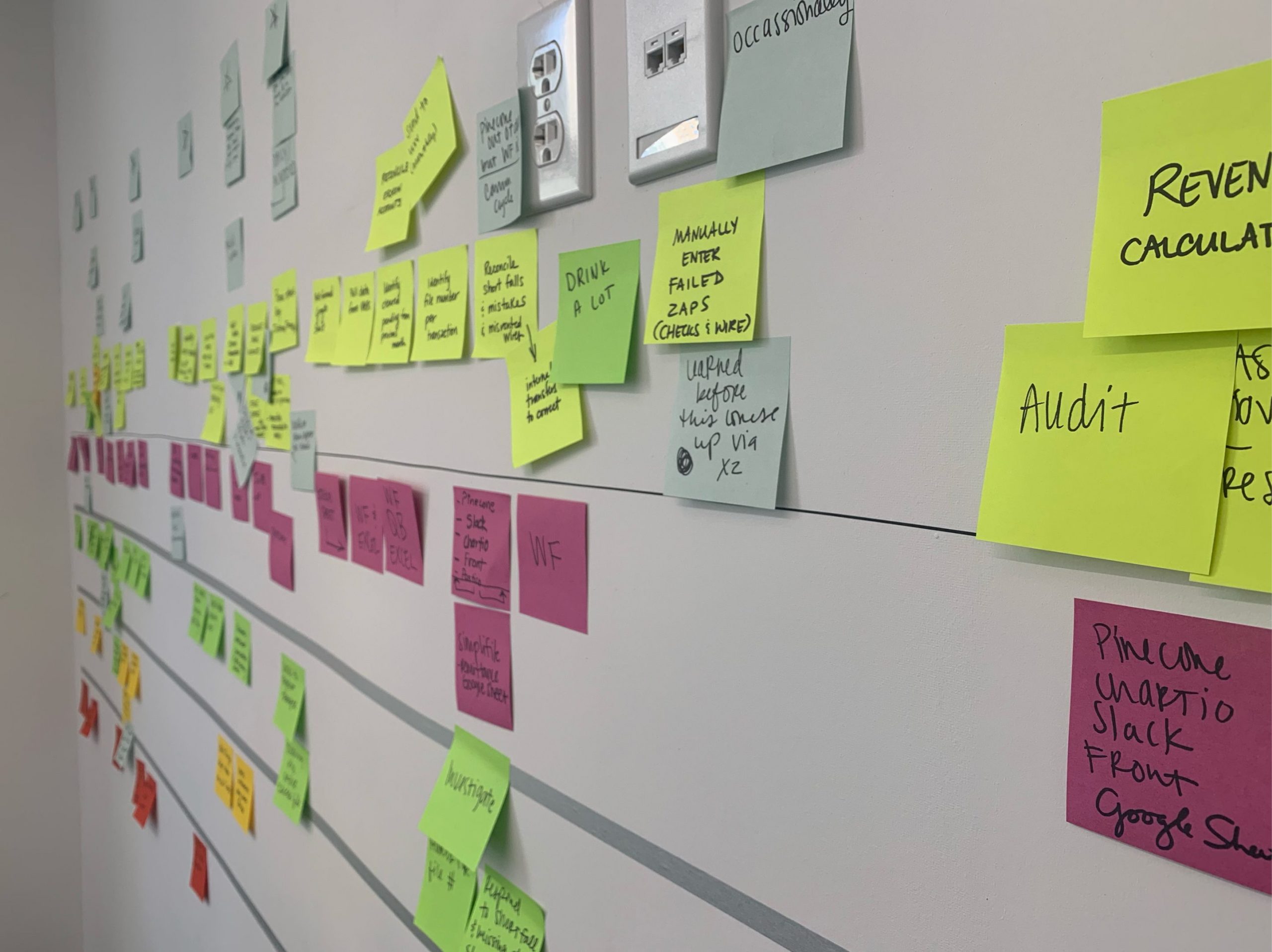
(Fig. 1 — Collaborative Service Blueprint Exercise)
Outcome
The workshop was an essential piece that helped me to continue exploring ways to close gaps in my understanding. It was clear that the current flow and UI were performing suboptimal and weren’t up to standards with the industry. With a birds-eye view, it became easier to generate and test ideas to determine which of the changes had a positive impact on users without risk to the business.
I saw the need to create the ability to visualize multiple processes and their sequences of the proposed solution into a single document. Ultimately, it enabled us to have better conversations, efficiency increase, and proper documentation.
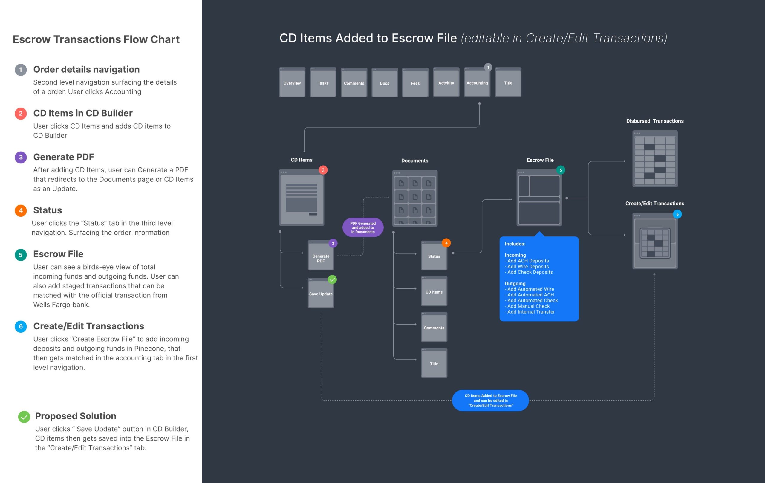
(Fig. 2 — Flowchart)
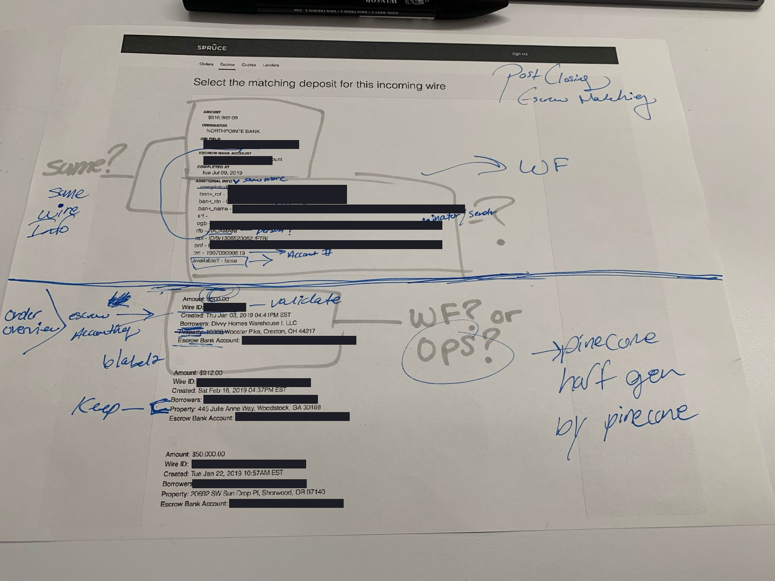
Observing Accountants
In most sessions, important details of an order were captured and stored on stickies on their desks. Accountants also used “alt + F” to search a transaction from a long list of running transactions. Another important insight I captured was the need for collaboration tools to streamline tasks, reminders, and comments.

(Fig. 3 — Observation sessions with the accounting team)
Phase 2 – Define
Interpreting The Findings
In a world of competing priorities, it made more sense to lean towards solving business needs due to the risks discovered. After a prioritization session, I began conducting a UX audit on the current UI. It allowed the team to see and iterate on broken processes which we’re confident would help inform future decisions.
(Fig. 4 — UX Audit, Feature Roadmap Prioritization)
Phase 3 – Experimentation
Iterate, Iterate, Iterate
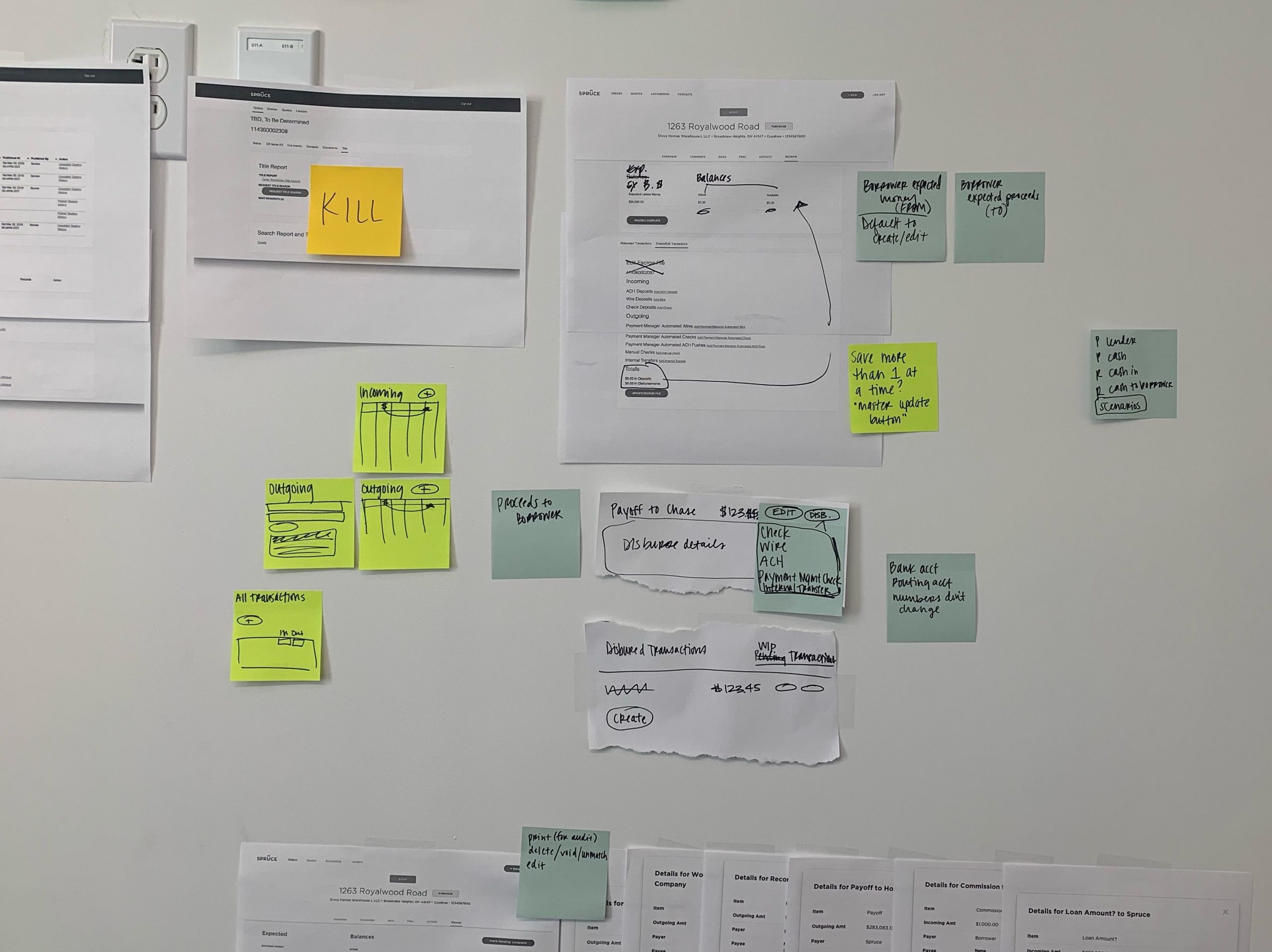
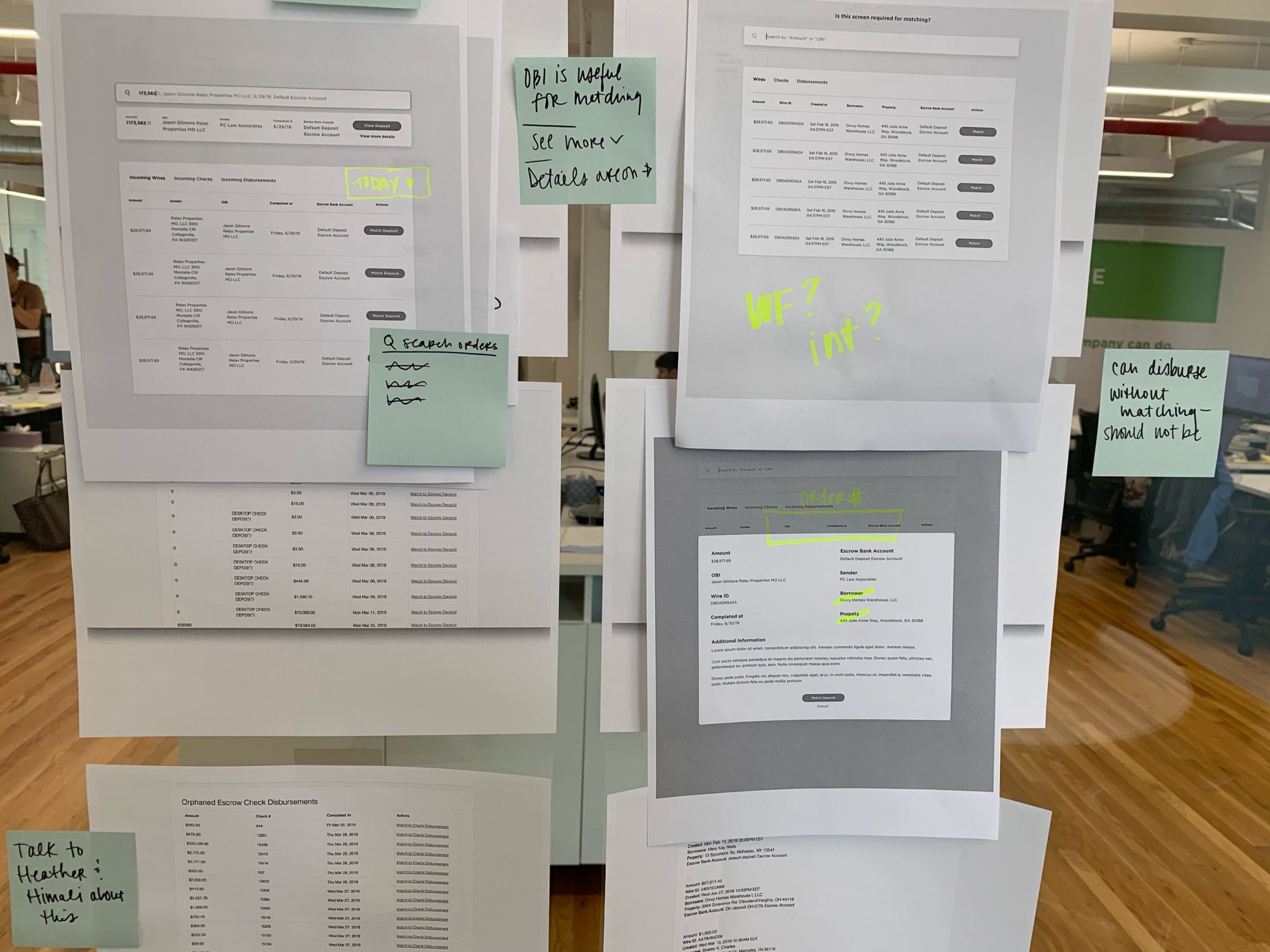
(Fig. 5 — UX Audits & Iterations)
Solution 1 – New Feature
Escrow Matching
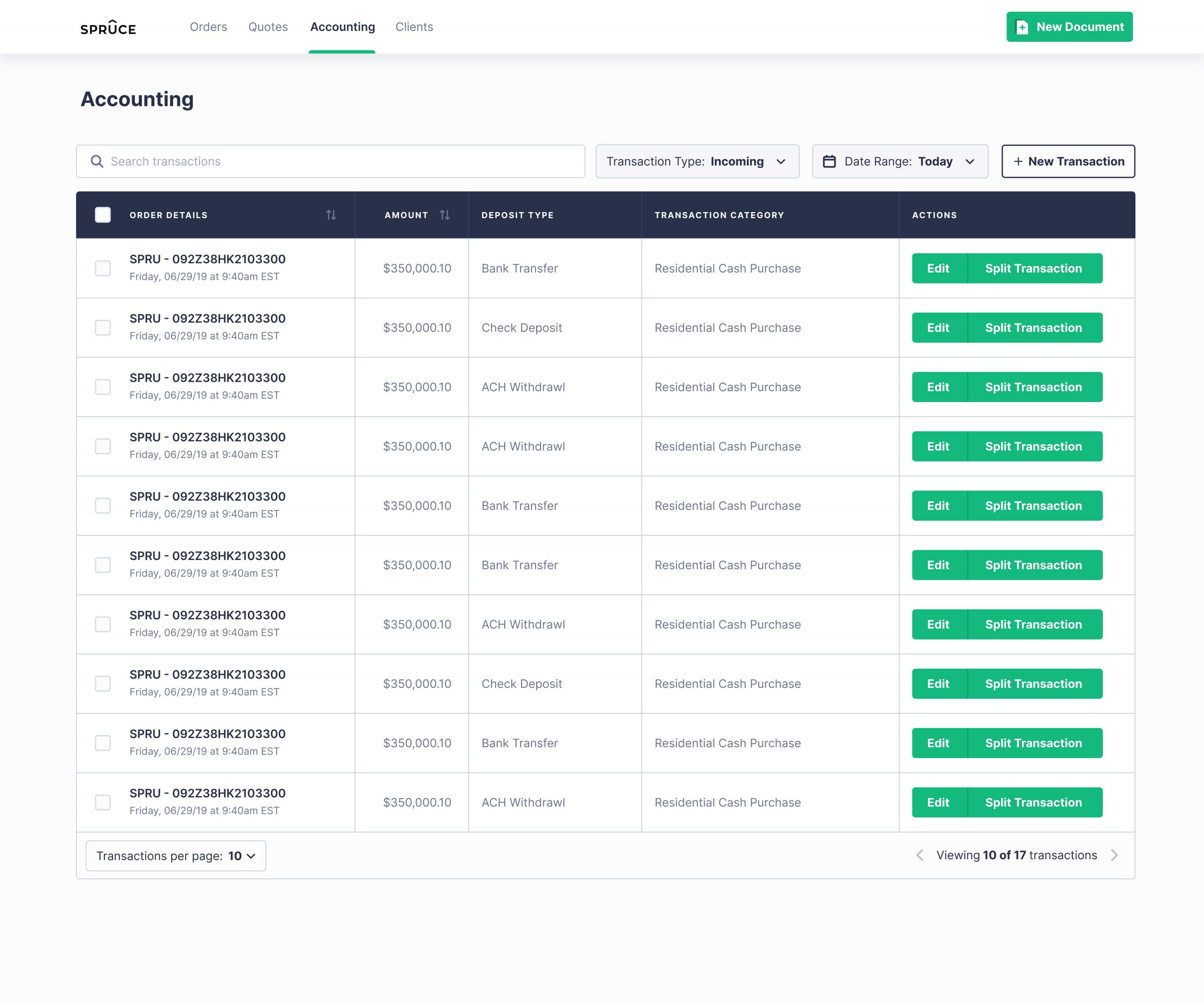
(Fig. 6 — Escrow Transactions)
(Fig. 7 — Escrow Transactions, transaction management)
Solution 2 – New Feature
Split Transactions
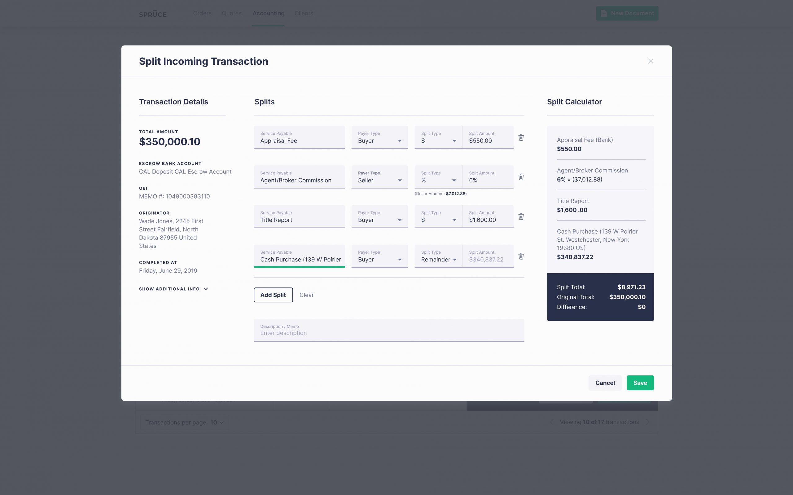
(Fig. 7 — Split Transactions)
Reflect
Takeaways
We identified many problems, that differed from the initially stated problem, then collected all of our insights. These insights led the business team to change direction. If you have evidence to support it, don’t hesitate to propose a pivot or make a change. Thanks to our efforts, we were able to advocate for the users more effectively and develop a solution that increased their efficiency and improved the business.