1st Problem

Double-charging

According to Google’s search engine, double-charging is ranked number 1 for the term “metrocard machine”. Double-charging or overcharging has become a common topic, yet it continues to happen often and causes citizens to become more frustrated.

Click here to view search results

2nd Problem

Subway Congestion

During my contextual inquiry, I observed that subway stations can become congested and the lines to use vending machines are long. NYC/NJ commuters are always on the go, while the MTA's brand and mission is to provide commuters with quick and convenient transportation.

Phase 1 – Exploration

The Kick-Off!

To get started, I analyzed the company and the user’s journey from a  product perspective. My first step was to get a better understanding of their legacy systems in place. I took a deeper dive into the company’s background, analyzed its products, and read customer reviews. The two major customer pain points were: 
  • The current card purchasing kiosk, which is an MTA legacy product; caused hundreds of double charges per day. Through research, I discovered the kiosk was manufactured in a time period people didn’t use online purchases as often.
  • Subway congestion was a huge pain point, especially for people who regularly traveled in and out of the city.

User Interviews

After becoming aware of the legacy card purchasing kiosks being outdated, I interviewed actual users. Users also complained about various issues. The most common complaint is that they were charged twice for a product of one. Users also admitted that they were encountered with machines out of service, delaying, and double charging. 

Insights

  • Subway stations can get congested, and lines at the machines can grow long depending on location.
  • In the New York metropolitan area, commuters are always on-the-go. This coincides with the MTA’s identity as a rapid transit system.

Personas & Scenarios

The primary persona, Patrick (not his real name), is a commuter from New Jersey who represented the interviewees with two or more MetroCards. He also represented interviewees who felt comfortable linking their bank account and credit cards with e-commerce businesses. I developed two new personas who had security concerns about online transactions and wanted to have more payment options.
With Patrick in mind, I created a scenario for setting up an auto-fill option for his MetroCard. This scenario began to set the stage for feature prioritization, by having to focus on what specific task Patrick wishes to complete. 

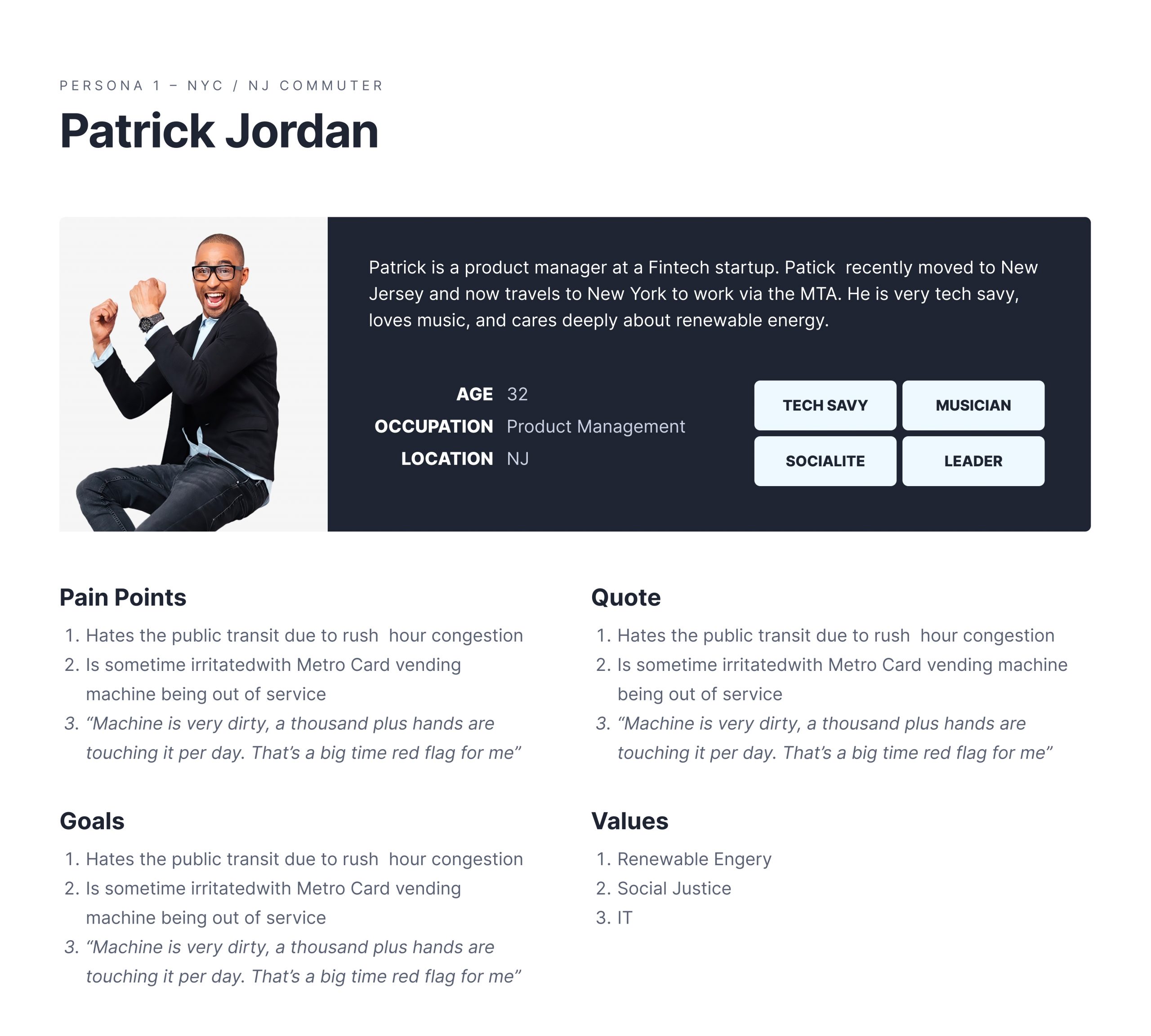
(Fig. 1 — User Personas)

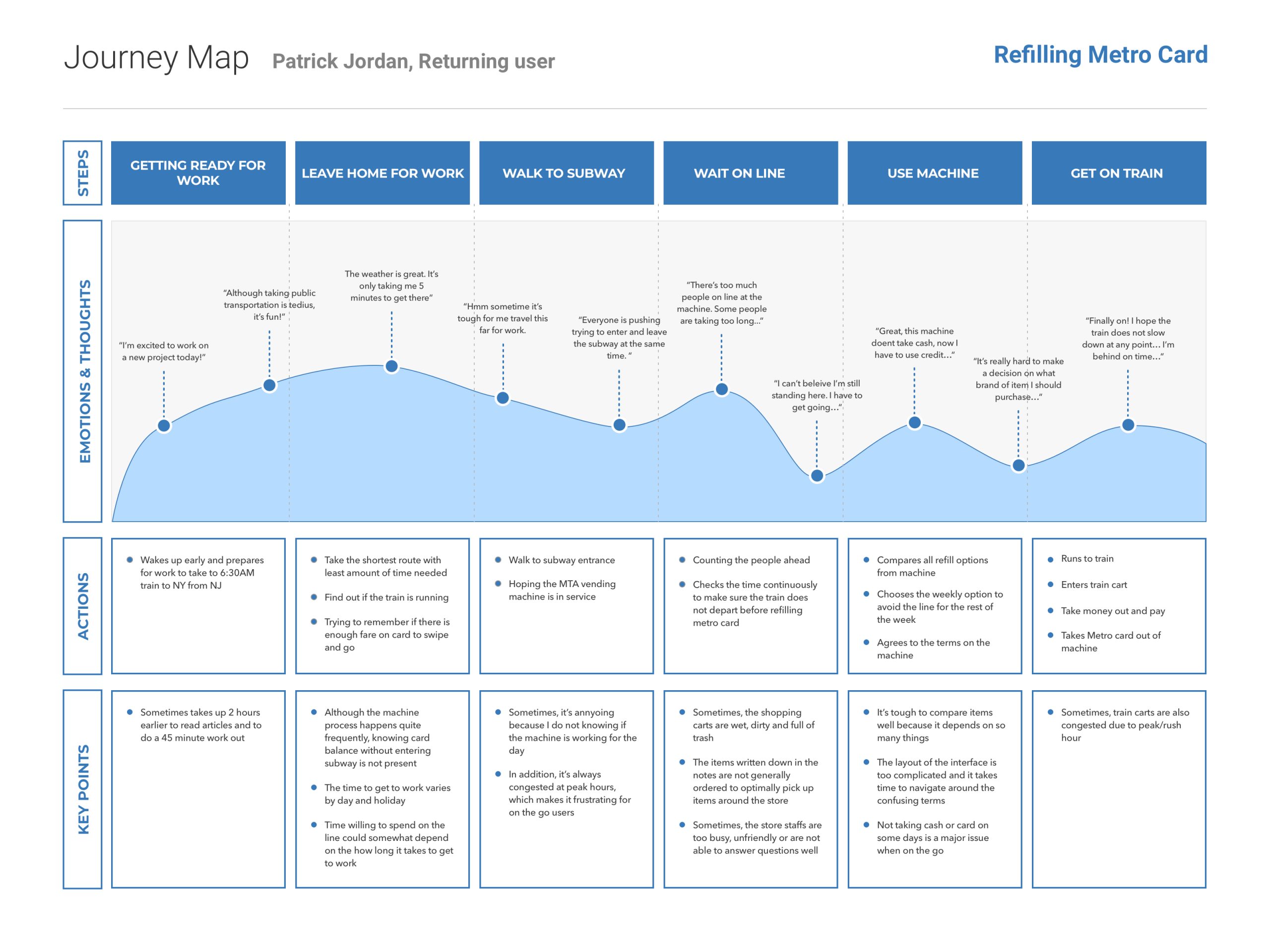
(Fig. 2 — Journey Mapping)

Phase 2 – Interpretation

Defining what I just learned from users.

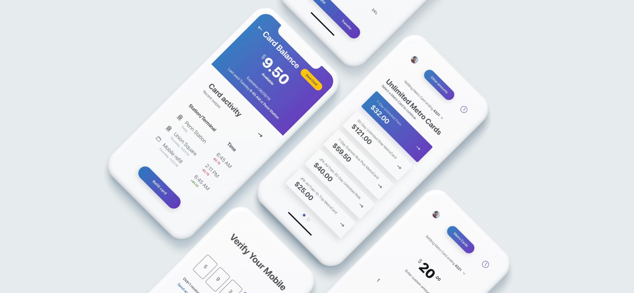
With multiple forms of research completed, I now had a sense of what kind of features MTA commuters would want in a design solution to their problem (i.e., to give them the option of mobile Metro Card purchasing, and on-the-go), and what kind of features comparable transit systems’ apps included.

Feature Prioritization

After conducting research, it became clear to me what features MTA commuters wanted in a design solution. In addition, I spent time researching other transit-related mobile applications that revealed a number of features to consider.
I started categorizing features under four categories: High Impact, Low Impact, Value to User, and Feasibility. Once I prioritized the features in sections, it became clear that the one with high impact and low feasibility would have a greater impact with a faster turnaround for MVP. 
Other features, like adding value or time, would be equally likely to satisfy users but have a strong impact on their experience.

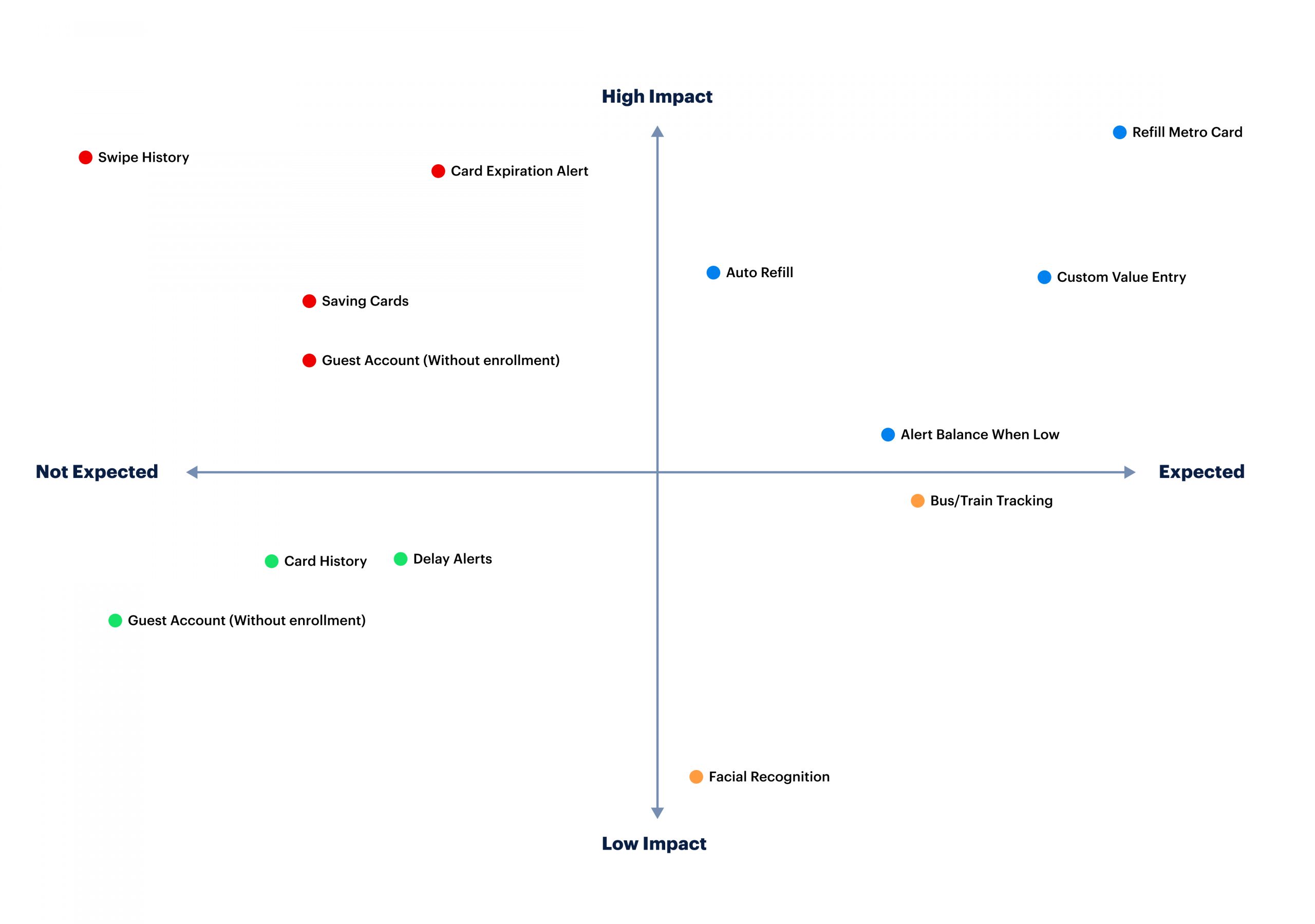
(Fig. 3 — Feature Prioritization Matrix)

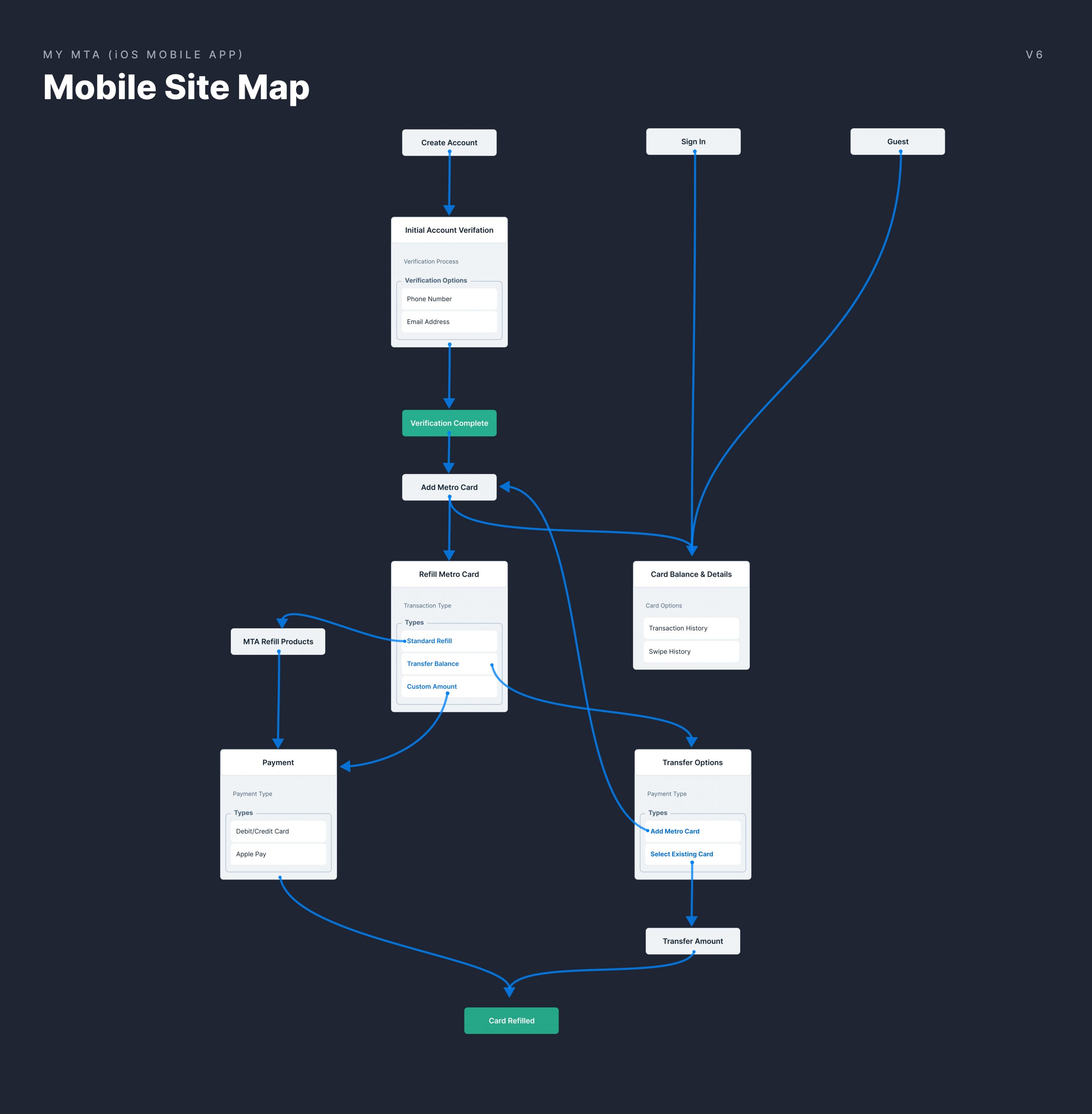
(Fig. 4 — Mobile Sitemap)

Phase 3 – Experimentation

"Design doesn't live inside a vaccum..."

After deciding on the central features of the app, I began sketching what individual screens might look like using these features. After sketching several home screens and refill option screens, I produced two mock-ups that showed users how to add value or time to their MetroCards as well as how to see their account details, transaction history, and card usage history (card management).
I also sketched one other option that would show subway line options, commute times, and travel routes. During this time I had a pretty good sense of how each screen might look, but there were still some details to be worked out in terms of functionality as well as aesthetics, so I continued working on these mockups throughout my design process.

Refining Design Decisions

I was able to refine my design decisions by comparing different approaches for each individual screen within the app itself (with varying amounts of detail) and also by looking at similar apps (both mobile apps and websites). In doing this, I found it very helpful to narrow down the scope.

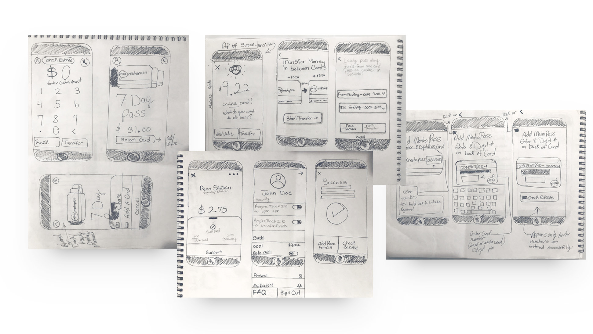
(Fig. 5 — Paper Sketches)

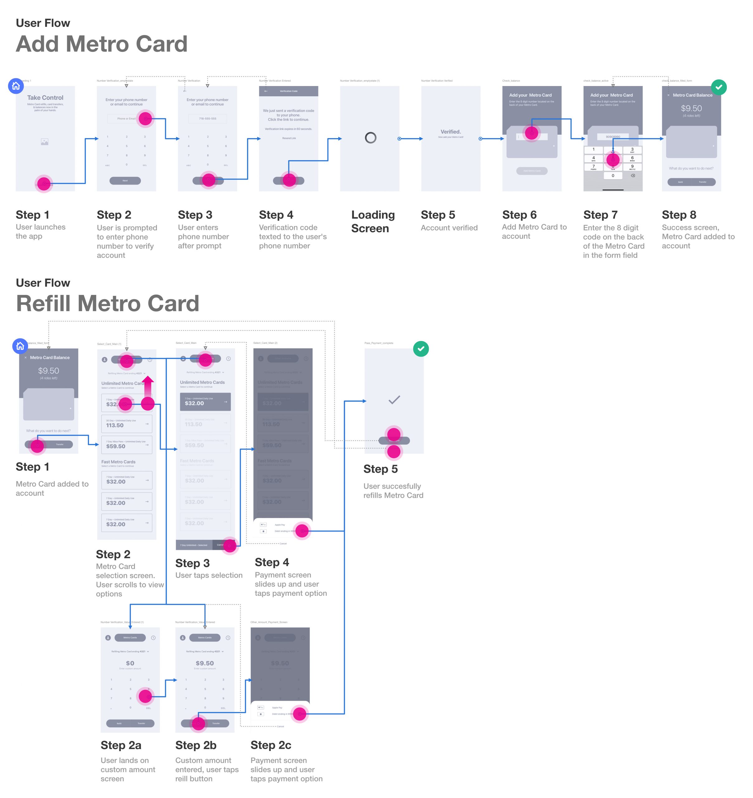
(Fig. 6 — Wireframes + User Flow)

Testing & Iterations

I tested the design by observing users as they tried to refill their Metro Card and took notes about particular pages in that task flow. User testing showed that there was some difficulty when a user wanted to refill their Metro Cards if they did not know how to do so.
After the testing sessions, I worked on these issues in the next iteration by removing the floating action button and linked the button directly to the following screen. The results from the following testing resulted much better along with side other findings that were iterated upon as well. I quickly learned that even the most basic, obvious design concepts can confuse people if they find them confusing.

Additional Findings

Another key finding was how the users interacted with the open animations of screens. Although it felt fluid and nice to watch, some users would wait for the animation to finish before starting their task. It created a high context switch in which the user had to stop what they were doing and wait for something to complete when they could have just continued on. This showed me the importance of A/B testing designs because even small changes can make a big difference in usability.
Another interesting observation I noted from this user testing session was that although there were several different tasks, none of them required completion prior to moving forward. The users asked questions about items such as tapping cards and swiping through cards.

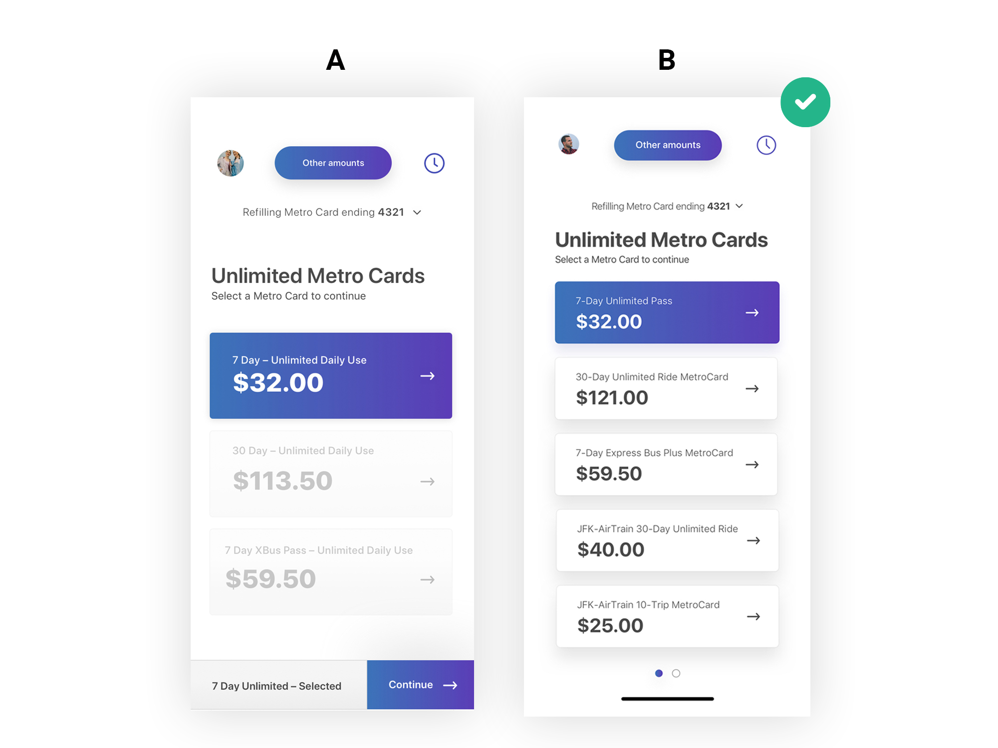
(Fig. 7 — Testing Iterations)

Implementing A Design Standard

Visual UI Design

To make the process of my design easier and faster, I used a well-known design system kit that is readily available. Particularly among those working on their mobile devices, I wanted to create a design that would help people feel more comfortable in the app by using colors that are reminiscent of the MTA brand and the purchasing kiosk experience. I chose this minimalist kit to accommodate the research I conducted. This ultimately helped me to reduce cognitive overload while fulfilling the user’s needs.

(Fig. 8 — UI Kit used a guiding principle)

After completing my first iteration, I conducted research to see what people thought of the app. By conducting this research, I was able to anticipate any potential problems that might arise. While reviewing the design with users I was able to identify areas where usability could be improved upon, which ultimately led me to create a second prototype as well as an animation for how the application might operate in real life.
By doing this iterative process – creating designs and watching it fail – I was able to adjust my design based on user feedback. Throughout the entire process, I consulted other designers who reviewed my work and gave great advice on how to improve my project.