Problem
Viewing and uploading PDF documents by signer type, document type, signing method to Pinecone (internal-facing admin tool) were key use cases for operation workflows. This function was needed to better sort through documents types, signed by a borrower or seller. It also needed to show how either the borrower or seller signed the document.
However, this functionality was limited in Pinecone. All documents were displayed in a table view, with the file name automated by the platform after a user upload task.
This was also designed by an engineer, which caused the operations team more manual tasks to complete. Also, this application was on a different version than the rest of the applications parallel and dependent on this application.
Objective
- Redesign the current upload flow using a new design system. Allowing users to assign, signer type, document type, signing method to a document being uploaded
- Allow user to rename document after uploaded before saving and publishing the document to the assigned lender to the order
Challenges to success + Technical Constraints
The backend was built in Rails and used a legacy style guide designed by the founding back-end engineer. Redesigning applications from the rails codebase was high effort and high value. The biggest challenge to success was redesigning without technical debt or financial loss to users, clients, or the business.
Platform
WebApp
My Role
Lead Product Designer
Team Structure
Product Manager, Director of Design, FE + BE Engineers
Timeline
1 Month
Success Metric
Task Completion
Design Approach
Due to the time constraints and user needs, iteration phases for validation,
and the value, a Lean UX process was suited best for this choice of the feature release.
and the value, a Lean UX process was suited best for this choice of the feature release.
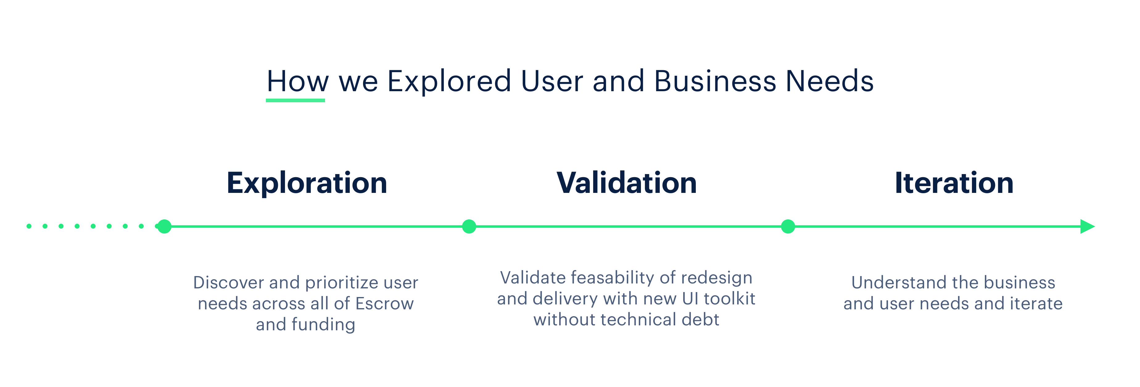
Observing Users
Contextual inquiry
I conducted a contextual inquiry to get a sense of how the current flow of uploading a document impacted users. This included shadowing five users from the operations team and creating a thematic analysis, as that gave us more data that assisted us in the redesign of documents. The current uploading experience is an outdated one; this flow was designed by an engineer.
Insights
More than anything else, the internal team relies heavily on external tools outside the application to complete tasks. Such as pen and paper to for reminders on the type of document uploaded, needing to be signed by either, seller or borrower and the way the buyer or seller would sign the document.
”Anything is better than what we currently have...
Operations manager
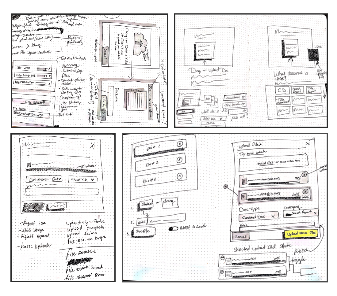
Early-stage wireframes
Paper sketches
Once I had an idea of the flow of the app, I sketched out key screens so I could get a sense of the general layout. I then used those sketches to create a mid-fidelity grayscale prototype with limited functionality to test on users. I focused on a couple of ways to kill the extra page that got in the way of users completing tasks.
User testing sessions
I conducted onsite and remote testing through InVision and allowed users to interact with my mid-fidelity prototype by completing missions that mimicked how a real user would upload a document type with a signing method option for either seller or borrower.
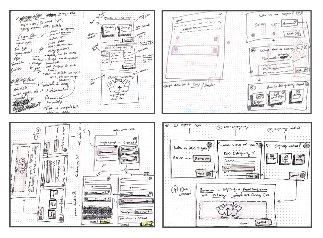
Concept #2 (Iteration loop)
After testing the first prototype, users hiccuped on uploading and assigning categoty types to the document. So I went back to the drawing board for a more self directed intuative solution.
Aligning Early & Often
After sketching and reviewing with product management and engineering, additional requirements were discovered. The second iteration loop of low fidelity sketches tested better for functionality and feasibility than the initial sketches. I started mocking up a mid-fidelity prototype and began testing for the second time with a more informed solution.
Final sketch
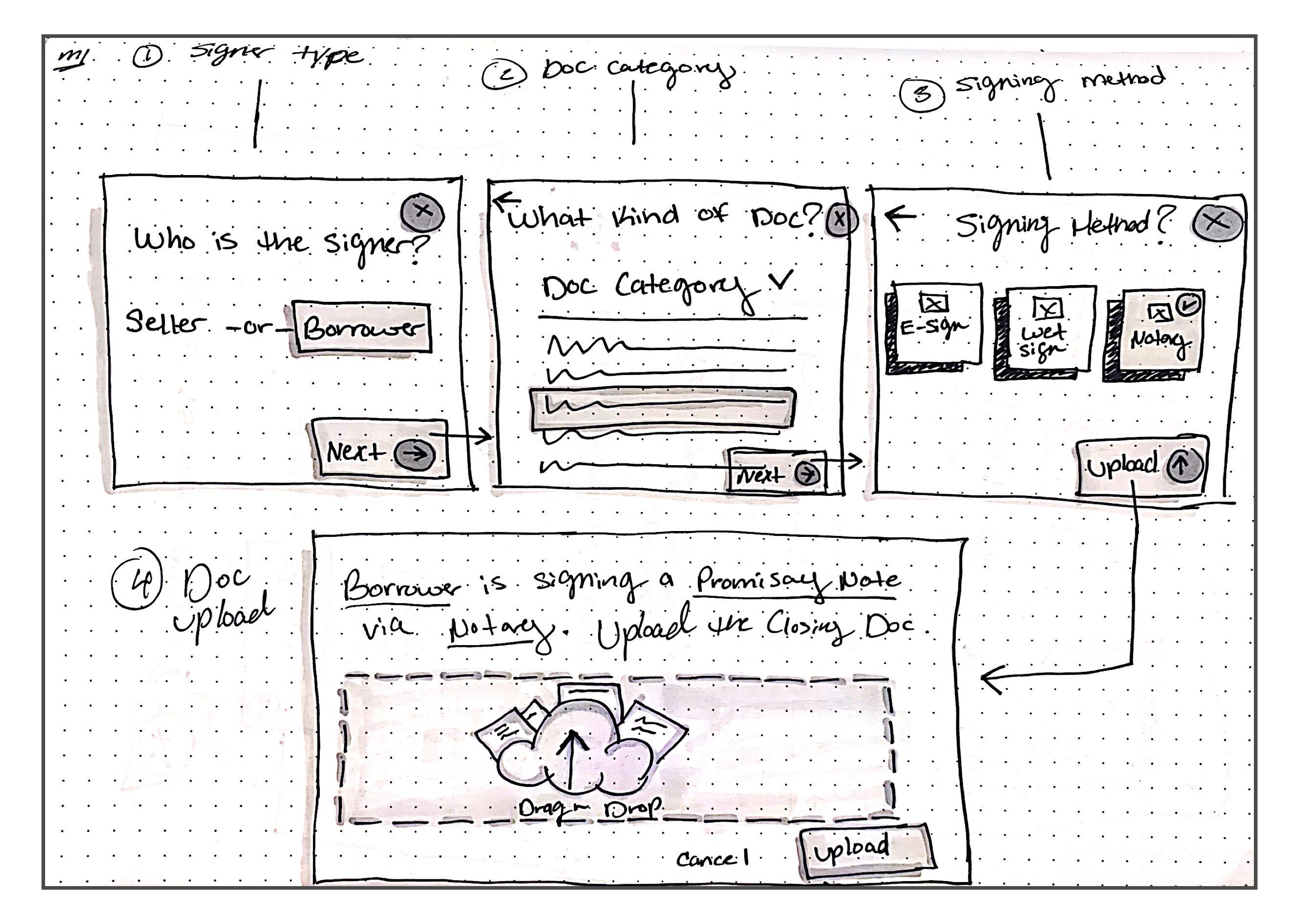
Fig4. – Final low-fidelity sketch
Reusable UI Components
Beyond the design system
I had to go beyond the visual language that already existed within the design system. The intention was to solve all user needs without UX debt to parallel applications dependent on the documents screen. I leveraged research to gain inspiration to architect visual hierarchy by using the 8-Point Grid system. This created consistency to match the vertical rhythm on the documents screen.
Renaming Documents
In most cases, users mentioned the documents view became difficult and time-consuming to sort through over the lifecycle of an order. This is because documents became versioned upon regenerating or re-uploading, so the need to rename a document after uploading was essential.
Assigning Types
Natural Language Upload Form
Assigning types to a document using input fields that are embedded within a sentence, written in natural language. The user is asked for the same kind of information but in a narrative form. A natural language form reflects the mental model of a user better than a traditional form. This UI pattern is very promising and offers a neat streamlined solution for complex product experiences.
Conclusion
What I've learned
This project has helped broaden my system-level product thinking. I was able to build trust and relationships with cross-functional teams which also strengthened my ability to empathize with users. I was also able to foster strong collaboration by working with other teams tackling similar challenges.